
Every year there is some blogger coming out with their own predictions for March Madness. They provide a cheap interpretation of a box score; or they have an analytical model but never show how they arrived at their conclusions. In light of this, I have begun to build a model of my own with the goal of mathematically predicting the winner of the Atlantic 10 Tournament.
This is not going to be a prediction in which I google for box score stats and perform an amateur reading of the numbers. Instead, I will leverage the data techniques that I use every day as a consultant to make the prediction on which team will win the 2020 Atlantic 10 Tournament.
THE DATA
The most important piece of any model is the data. For reference purposes, all the data for my analysis was collected from Basketball-refence.com. As you will see later in the piece, understanding your data can make or break any model. If you don’t understand the data you can easily apply the wrong analytical tools.
The current dataset contains every A10 team’s season stats since 1995. In order to increase the sample size I have included teams that are no longer in the Atlantic 10. Additionally, every team that had won the Atlantic 10 tournament for a season was marked a “1” , and a “0” if they lost. Below is a sample of the data set’s variables:
![]()
What is most important for this analysis is the question of if a team won the A10 tournament or not? Specifically, I am concerned with finding which variables and attributes indicate a team is more likely to win.
PCA
The second step in the analysis was to apply the Principal Component Analysis to the data. PCA analysis attempts to group data points based on similar attributes. The goal is to use PCA to understand if there are correlating variables which can successfully categorize teams as winners and losers of the Atlantic 10 tournament. A main part of the analysis is picking how many components (or groups) the algorithm will attempt to place the data into.
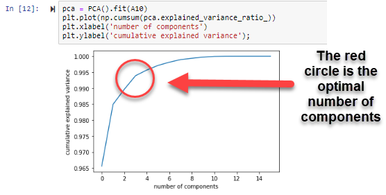
As the line moves closer to 1.000 on the y-axis, the more the model will be able to explain the variance in the data. The highlighted point in the graph above represents the optimal number of components for our PCA function, which is two.Finally, after recognizing the number of optimal components, I applied the data set to the PCA function. As you can see in the output below, I used Python to run the PCA function.
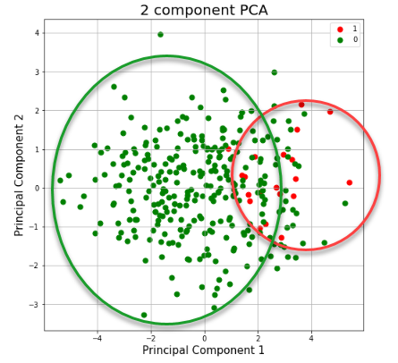
The red dots, marked as “1”, are teams that were grouped in likeness as A-10 winners. The teams marked in green were teams with attributes of losers. This is not what an optimal PCA would look like. Of all the data collected, the function was able to group only 85% of the data. This means that 15% of the collected data could not be successfully assigned to a group.
Conclusion
A good PCA should provide a clear linear relationship between grouped data. In an ideal world the PCA graph would show those data points in a somewhat straight line. However, the PCA is just a random scatter of data. In addition to the scattered data, the model was only able to group 85% of the data. This means new variables will need to be added to improve the analysis.
Building a prediction model is not an easy task. Going into this I knew that I wasn’t going to have a perfect model without some trial and error. This series of pieces is going to continue to highlight the design and re-testing that goes into analytical analysis. Next week’s piece will cover: new variables, an updated PCA , and a logistic regression analysis. Hopefully by March 10th our model will be able to predict the A10 Tournament winner!
For more SJU coverage, follow me on twitter @Jelly_Morelli and check out my podcast “Tony’s Takes” on Apple iTunes. If you have a data science background please reach out with questions or recommendations!