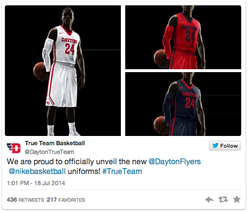
 Hot off their first Elite 8 appearance in 30 years the Dayton Flyers are ushering in a new era of Flyer hoops with a brand new logo, court and set of uniforms.
The company that most recently brought us an updated Atlantic 10 logo as well, 160over90, in consultation with Nike, came up with the new design the utilizes a simplified flying D logo as well as a modernized updated font.
“The new image is an investment in our athletic program’s future,” said Tim Wabler, University of Dayton vice president and director of athletics. “This is a stronger, more iconic representation of our program and our sports teams — one that will set the direction for the next generation of Dayton Flyers. This is more than just a logo; it’s an affirmation of our commitment to meet the challenges of today’s intercollegiate athletics environment.”
A range of input was sought in the design of the logo, including opinions from student athletes, coaches, alumni, boosters and faculty.
“Our new logo will certainly be a success factor for our program,” said head men’s basketball coach Archie Miller. “From the start, I’ve been an advocate of a unified identity which can continue to sell a new day and age for our program. Our brand is as strong as it’s ever been and this will continue to keep us in the nation’s basketball mindset. The University of Dayton has always had a great image locally and within our campus community. This will only set us up to be even more connected as we move forward. It’s a special time to be a part of this re-branding, and it’s essential to our future.”
As expected, reviews have been mixed thus far, with some early detractors suggesting the flying “D” design looks less “UD” and more “VD”, as well as a number of other hilarious suggestions. Overall there seems to be more positive than negative feedback however, but as expected Dayton Athletics should prepare to hear the negatives the loudest over the next week, including on their voicemail and in their inboxes.
In the meantime enjoy some of our favorite detractor comments:
. @DaytonFlyers I am worried that this “logo” might actually be some graphic designer’s suicide note.
— Tom Costello (@tcostello) July 18, 2014
As @vondercc pointed out, turning the logo sideways shows an elephant on a cliff #republicans? #Illuminati pic.twitter.com/lC1aiQg7JS — Brian Vonderhaar (@BrianVonderhaar) July 18, 2014
Shout out to the Dayton University student intern who spent a full 7 minutes on MS Paint putting that new logo together.
— Jeff (BPredict) (@BPredict) July 18, 2014
UD, noooo! What is this an airline or freight company logo? pic.twitter.com/LZqLYYKDsF
— Fran Fraschilla (@franfraschilla) July 18, 2014
There has been a ton of positive feedback to Dayton Athletic’s new visual identity, just not nearly as entertaining.
12 Comments
RT @A10Talk: Dayton unveils new logo to mixed reviews: http://t.co/OblglYKnfv
Mixed? Mixed??? It’s a travesty! “@A10Talk: Dayton unveils new logo to mixed reviews: http://t.co/Eo7kDwCCRx”
RT @A10Talk: Dayton unveils new logo to mixed reviews: http://t.co/OblglYKnfv
@A10Talk Yeah, I’m not a fan.
@A10Talk Also, I’m sure Pitt had a lot of the same justifications as Dayton when they unveiled their short-lived Otter.
RT @A10Talk: Dayton unveils new logo to mixed reviews: http://t.co/OblglYKnfv
@DuquesneDave @A10Talk Flyers fans are hoping this will be short-lived, but unlikely. Spent too much $. #don’tfixwhatisn’tbroken #badlogo
Agreed. RT @hudiehu: Mixed? Mixed??? It’s a travesty! “@A10Talk: Dayton unveils new logo to mixed reviews: http://t.co/iKys5uunSr”
RT @D8N_Barb: Agreed. RT @hudiehu: Mixed? Mixed??? It’s a travesty! “@A10Talk: Dayton unveils new logo to mixed reviews: http://t.co/iKys5u…
RT @hudiehu: Mixed? Mixed??? It’s a travesty! “@A10Talk: Dayton unveils new logo to mixed reviews: http://t.co/Eo7kDwCCRx”
@A10Talk horrible. Not a fan of the new “VD” logo. Thought this was a joke at first. Guess not.
@A10Talk mixed reviews? Overall more positive? #UDalumni seem to overwhelmingly hate it. #bringbackUD #WeAreUD