
There may be no accounting for taste but there is also no fun in avoiding the discussion of who were the best and worst dressed teams in the Atlantic 10 this past season (how have we not done this already?).
Everyone’s team has flirted with both sides of the list. We’ve all seen our squads roll out the fan favorites that occasionally make a second appearance as a popular throwback alternate (like Richmond’s barber poll classics) as well as the major misses that we’d love to see burnt with the results of an unsuccessful season (VCU’s cartoon font years). This year was certainly no exception.
Here are my five bests and worsts from 2013-14.
THE BEST
 1. VCU – VCU hit the trifecta in that all three of their uniforms were spot on. Their home whites looked flawless with black and yellow pin-striping going down the sides, their black uniforms looked intimidating and pro while their gold alternate with cursive “Rams” script just looked damn cool. Best yet, they were all well-fitting cuts that didn’t make their players look ridiculous. VCU introduced a new logo months after debuting their 2013-14 styles so this year’s look will unfortunately be a one-year wonder.
 2. George Washington – The Colonials buff and blue kits made them look like Capitol Hill’s team, like they were more important than the opposition and had some serious business to attend to after the game. Their alternates with GW chest logo are one of the best color combinations I’ve seen on a uniform. Having the name of the first President of the United States of America gets you bonus points.
 3. Richmond – The Spiders used a similar style of uniform Nike dressed a slew of teams in but made them look perfect with their classic red, white and blue color scheme and spot-on font choice. UofR’s white home uniforms are one of the best simple uniforms in the conference thanks to the red numbers and classic navy “RICHMOND” text/font and their red alternate (same style as VCU’s three uniforms) with spider chest logo made them look like superheroes (in a good way).
 4. St. Bonaventure – It takes a special kind of player to pull of a dark brown uniform. The Bonnies have one of the most unique color schemes in college hoops, which I happen to think is incredible, but realize others (including probably some Bona fans) may feel the exact opposite. Regardless, I throw them at No.4 on our best dressed list because of their handsome dark brown road uniforms and show-stopping light brown alternates with horizontal striped sides. They move up the list if they bring back the stripes on all of their uniforms.
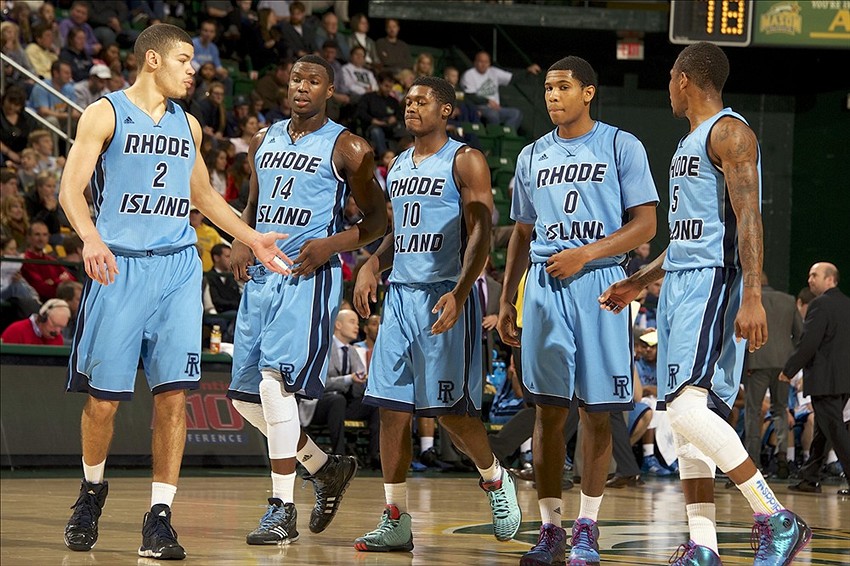 5. Rhode Island – Rhody has a built in advantage with one of the best color schemes in the conference. The light or “keaney” blue combined with navy is hard to screw up and they certainly didn’t do so this past season. Rhody brings the only Adidas uniform to this top five as both home whites and keaney blue editions are quite sharp with bold “RHODE ISLAND” text and choice side striping.
THE WORST
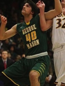 1. George Mason – The perfect example of how color scheme, font and a few design errors can make a negative difference. For me, their green road uniforms look drab while their white uniforms with yellow outline around green text on the white background just don’t work. The text and number fonts don’t match or work together either, making all of Mason’s options a miss.
 2. Saint Joseph’s – What I like about the Hawks’ uniforms: they are different and apparently good luck. What I don’t like: they look terrible. Saint Joseph’s mixed it up this year after going with a more common uniform the previous season, opting for shorts that included a belt look with an 80s graphic fade of sorts down the sides. The home whites were the best of their selection but the road crimsons were one of the worst in the league, landing them at No.2 on our list.
 3. Dayton – The worst thing about Dayton’s uniforms is they were one of the worst fitting sets in the league. The Flyers’ jerseys looked like giant pillow cases that someone cut three holes in, a very early 2000s look that is still apparently popular in Dayton, Ohio. Throw in a 90s graphic explosion all over the entire uniform and you’ve got one of the worst uniforms in the conference.
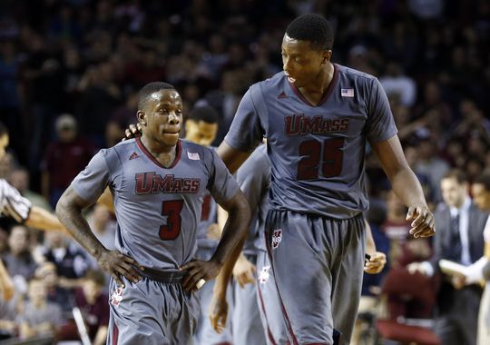 4. UMass – Sometimes you need to take the base hit instead of swinging for the fences. Instead, UMass struck out with their short sleeve gray extreme sweat-gauge experiment. Gray uniforms in general can be a bit played out, but add in the sleeve and the uniforms ability to show every drop of sweat in its exact location and you have a problem. When I first saw them I didn’t know if I was watching a basketball team or the All-American Girls Professional Baseball League.
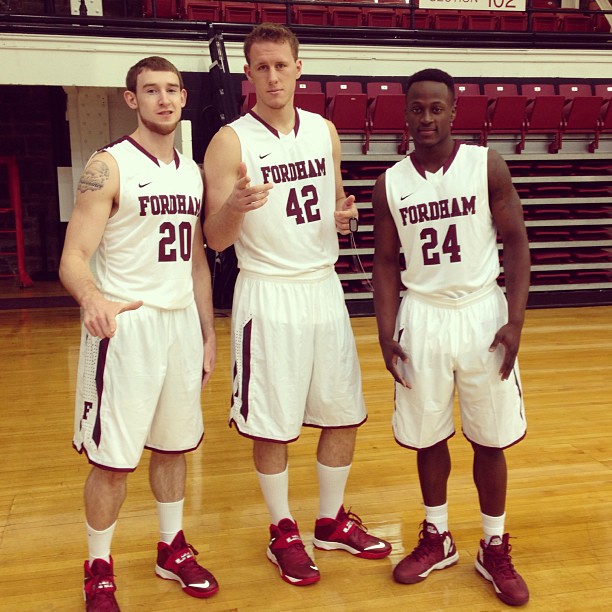 5. Fordham – Hey, maybe I’m just not a fan of maroon/crimson (coincidentally my high school colors, although I swear I had a good high school experience). Fordham’s uniforms actually aren’t that bad (I had the five best, gotta have five worst), although I don’t particularly care for the black stripe on the shoulders or the dots on the shorts. I like that they kept with a simple font, trying to keep things relatively classic. I don’t know, you tell me…do these dudes (on left) look cool? Maybe these are great uniforms, I don’t know.
18 Comments
@A10Talk http://t.co/y0OVqCZNU6 #Ruimymlzvr3ju2
RT @A10Talk: A-10 red carpet: The best and worst dressed teams in the conference http://t.co/Kj9rmVtYlP
Rhody checks in on good side.“@CDiSano44 A10Talk: A-10 red carpet: The best/worst dressed teams in the conference http://t.co/eL0cAMUPfH”
RT @A10Talk: A-10 red carpet: The best and worst dressed teams in the conference http://t.co/Kj9rmVtYlP
RT @A10Talk: A-10 red carpet: The best and worst dressed teams in the conference http://t.co/Kj9rmVtYlP
“@A10Talk: A-10 red carpet: The best and worst dressed teams in the conference http://t.co/OGWuA4PeuJ” Let’s go VCU!!! So proud!!!!
gotta admit the line about the Dayton Flyers pillow case uniforms had me laughing #gorhody: http://t.co/od74bwc9Cg
RT @A10Talk: A-10 red carpet: The best and worst dressed teams in the conference http://t.co/Kj9rmVtYlP
RT @CDiSano44: Rhody checks in on good side.“@CDiSano44 A10Talk: A-10 red carpet: The best/worst dressed teams in the conference http://t.c…
UD’s unis suck but Sibert wore loose RT @A10Talk: A-10 red carpet: The best and worst dressed teams in the conference http://t.co/bYX3Pf0zr6
Do clothes really make the man? I like that the A-10 seems to think so! http://t.co/ZEtDiRAg06
RT @CDiSano44: Rhody checks in on good side.“@CDiSano44 A10Talk: A-10 red carpet: The best/worst dressed teams in the conference http://t.c…
The best&worst dressed teams in the conference http://t.co/uOhlpicqOe
it is like he had us miked when we talk about our unis @ibrahim_ak4
I may be a VCU fan, but I do give UR and St. Bonaventure credit, they have some of my favorite uniforms in the conference.
ICYMI: Our best & worst uniforms from the A-10 last season. http://t.co/F6pMwTmqKg Who were your personal favs?
“@A10Talk: ICYMI: Our best & worst uniforms from the A-10 last season. http://t.co/3UzGCHJ5hU Who were your personal favs?”
@Bonnieshoops @A10Talk Thanks from a Bonnies fan on putting us in the “good” section. I also think we have some unique “kits”.
RT @Bonnieshoops: “@A10Talk: ICYMI: Our best & worst uniforms from the A-10 last season. http://t.co/3UzGCHJ5hU Who were your personal favs…